Create your own theme in minutes!
In Convos v4.xx it is super easy to customize or create a theme.
Follow this detailed walkthrough written by Thibault Duponchelle on how to create a "hack3r" theme!
Smooth start
You have to go to the location where convos is running:
cd $CONVOS_HOME/themes
For you informations, $CONVOS_HOME is where convos puts all user settings and
user themes. See the
FAQ
for more details.
A good way to start is to copy paste an existing theme, choose wisely the one that is the simplest and closest to what you want to achieve:
curl https://raw.githubusercontent.com/convos-chat/convos/main/public/themes/high-contrast_color-scheme-light.css > mytheme.css
Here I chose light version of hight-contrast, but it would have been smarter to choose a dark version, since this theme I decided to create is intended to be black and green.
The name of your file is not important, the theme name will be included in the header of the CSS file.
Let's edit the theme:
$EDITOR mytheme.css
Choose your theme name:
/*
 * name: Hacker
 */
When you go to your convos instance settings, you will already be able to select your new theme after you have refreshed your page:
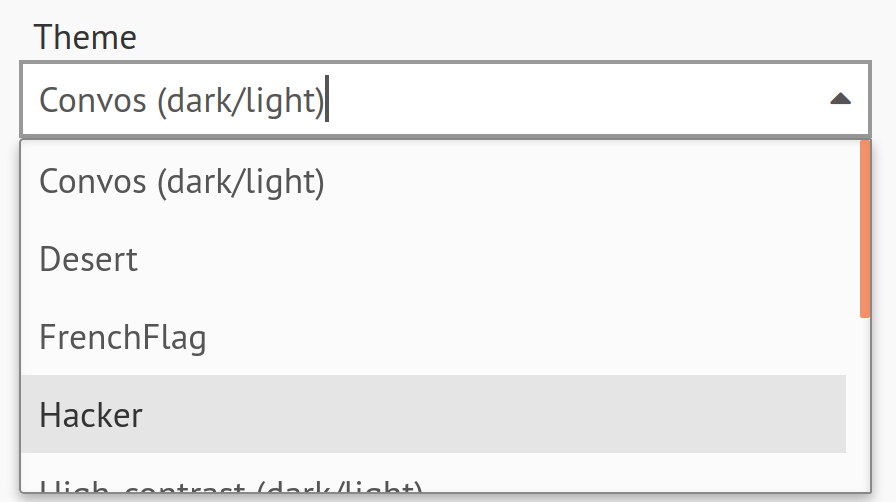
We created our theme, and switched to it. At the moment, our new theme is a
vanilla copy of high-contrast light but it's just a start and we can now play
with it (and it will be reflected in our convos in almost real time).
It is very easy to develop a new theme because without even having to restart convos, your changes are immediately viewable!
If it is your first theme, I recommend a light theme (light background and dark text), it is easier.
How do I choose the colors ?
Honestly I first started by typing "hacker theme green" in google image and I looked at results.
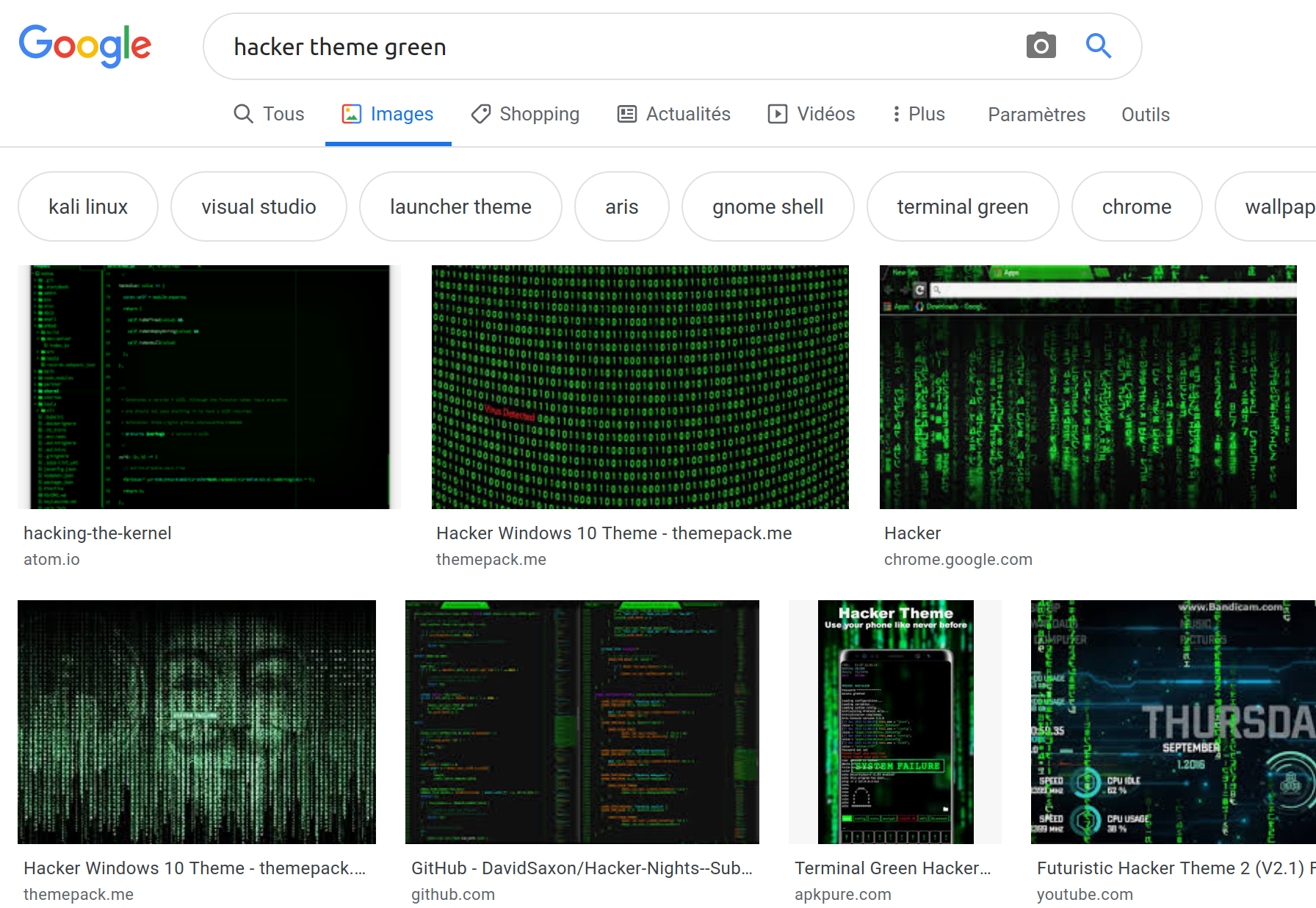
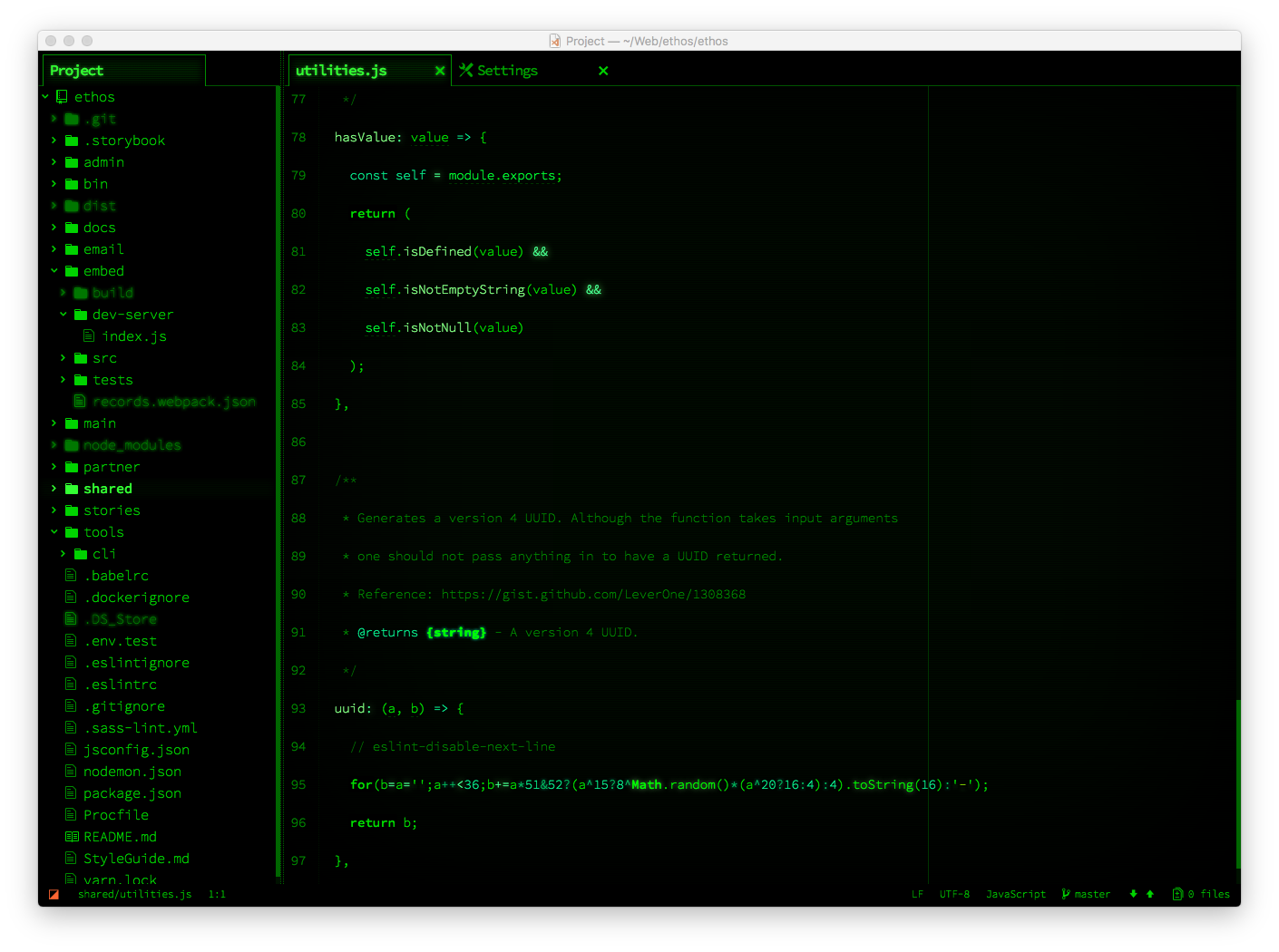
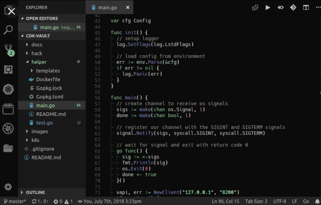
Some screenies were close to what I wanted to achieve. For instance this screenshot:
Or this other one where we see more inputs and listbox:
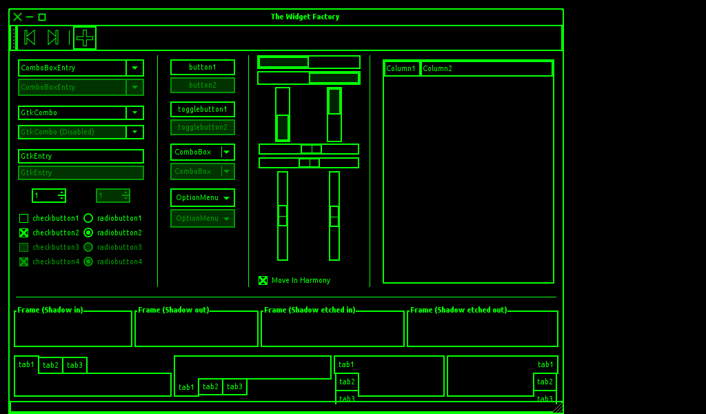
It gave me a better idea about what I wanted to do and which colors to put together:
- First the green is really flashy, let's go for flashy then.
- There is black background or eventually dark grey background. In my mind I was thinking "cool, I will try to put this grey on one panel!" because usually don't like having all convos panel the same color
- Text colors are usually green or grey
To have the color of the grey used in one of the screenshots (the grey in the treeview renders well with overall black bg):
I use the "eye dropper" from The GIMP:
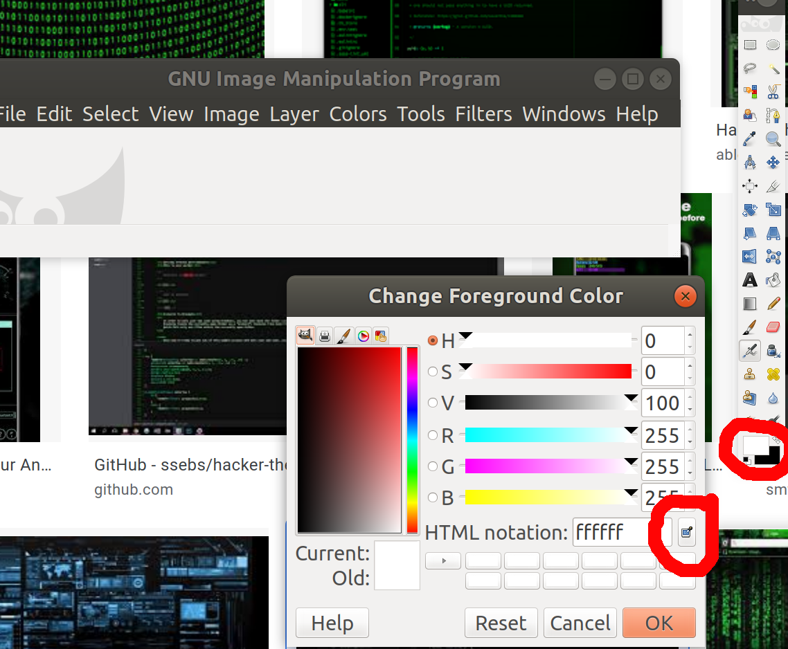
I used it to click magically on the color that I needed to know the value...
...And I get the html notation #181818 that you will see later in the CSS:

Another solution consists to use the eye dropper from Firefox:
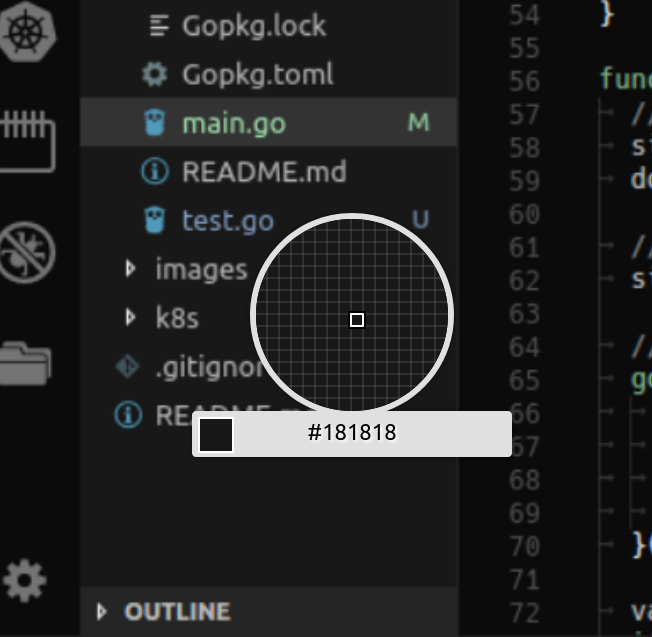
You find it in Menu > Web Developer.
Panel backgrounds
Ok let's start changing the colors.
It is a hacker theme, it has to be daaark!

Therefore I wanted to put black on left/mid panel and grey on right panel... I was actually not sure about how to arrange this, I made some tests and I finally used black everywhere!
Then look at our first modification.
/* Backgrounds */
--sidebar-left-bg: black;
--body-bg: black;
--sidebar-right-bg: black;
I can use color shortcuts names (black) or hex values (#RRGGBB from #000000 to #ffffff)
You can use for instance an online color picker to find colors values or shades.
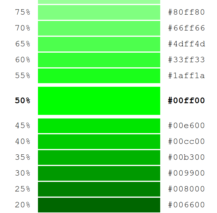
Let's imagine "I want a green like this one but darker" you can type the current green value in the color picker and choose another level of shade.
Edit text colors
Having such dark barckground immediatly revealed text color issues.
On the left I will use a hacker's green, on the right a grey and in the middle a light green with higher contrast.
/* Text color */
--text-color: #77ff77; /* The body text color (mid panel) */
--sidebar-right-text: #666666; /* Text color on right panel */
--sidebar-left-text: green; /* Color of rooms when connected (selected or not) */

Links
Next we can change the links color (send button, upload file, settings) to green (it is the hacker color that we will use with dark shades):
--link-color: green;
will produce:


Next, the highlight when you are mentionned. I will choose a red to hightlight when someone talk to me:
--highlight-color-bg: #990000;
I do not use red color name because it is too flashy.

Left side panel
We will try to put a lot of green here.
The more important here will be the shadow around the room when selected.
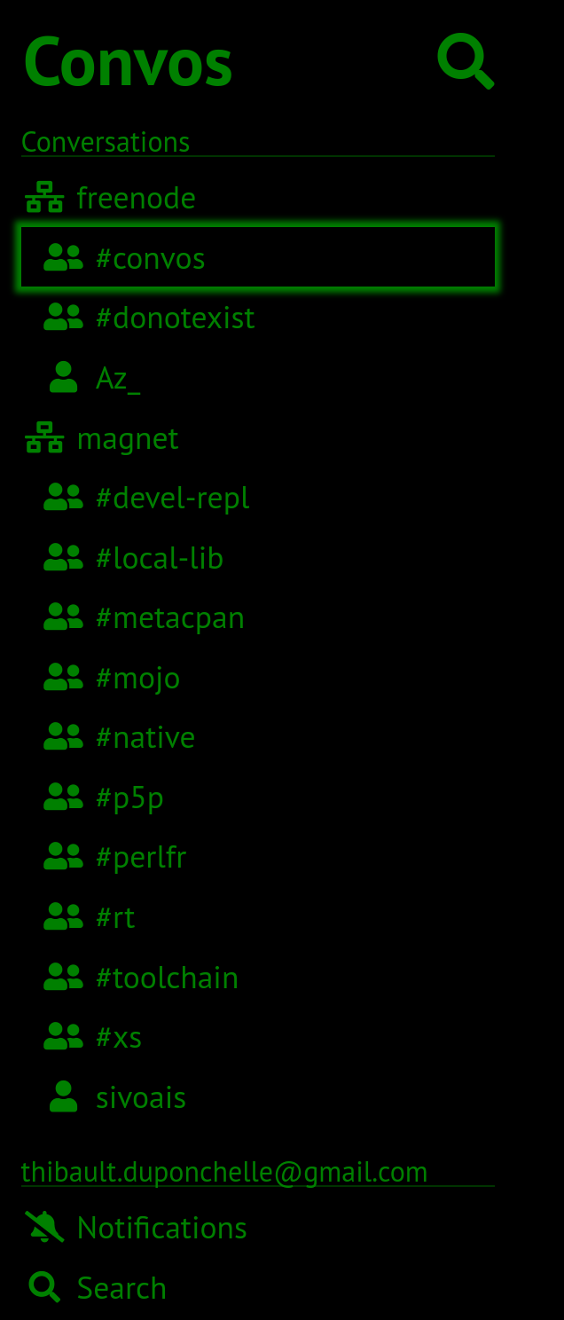
It is achieved with --focus-outline: 0 0 3px 3px rgba(0, 255, 0, 0.5); where
the rgba is clearly "give me a shadow of green".

Then I set the --sidebar-left-border: 1px solid black; (which is an invisible
border between left panel and mid panel.
Then I set the --sidebar-left-search-focus-bg: transparent; so that there
will be no background, only a shadow around.
I continue with --sidebar-left-frozen-color: #003300; that is what you can
see when you're not connected to a room (server does not exists or you're
actually in the process of connecting to irc).
To give you a demo, I started a connection to an server that does not exist (efff-too-much-f-net):

You can also disconnect from a server by disabling the connection in the settings:

And you get the same "frozen" effect:
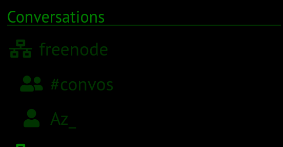
I will also change the color of left panel separator:
--sidebar-left-border-bottom: #003300;

With this setup, we have now a nice left panel:
Buttons
Now play with buttons. My goal is to do a green button with white or black or red text (depends what looks best) and when clicked appears darker.
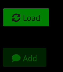
I start with --button-bg: green; and --button-color: #181818; to have this:
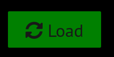
Border is hidden with --button-border: 1px solid black;.
For the disabled button I set something like this:
--button-disabled-bg: #002200;
--button-disabled-border: 1px solid #002200; /* The border of a disabled button */
--button-focus-outline: 1px solid #006600;
--button-disabled-color: #006600;
How to choose the color for disabled button ?
Testing...
But I can give you some hints:
- Use the shader discussed earlier
- And use darker shade on dark theme and lighter shade on light theme (darker or lighter shade compared to non disabled button).
Here the winning text/bg color duo is a light green for the background and a green for the text.
The disabled appears when a button is not clickable then both when disabled or when clicked (for a short period).
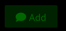
Now I now have this buttons:
Right panel
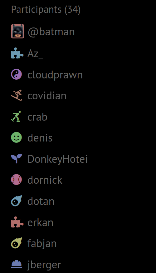
On the right the nicknames need some customization then I changed their color to grey:
--sidebar-right-text: #181818;
Various
I will also change the conversation separator to make it dashed and green:
--hr-border: 1px dashed green;

And I set the background color of code tag to red with --code-bg: red;

Inputs
I want also to add some sugar to my input focus to add a small green border, a dotter border when theyr are clicked and a light grey placholder text color:
/* Inputs */
--input-focus-outline: 1px dotted green;
--input-bg: #181818;
--input-color: #009900;
--input-border: 1px solid green;
It will produce:

and

Finally I added --chat-input-bg: #181818; to improve chat input box color:

Listbox
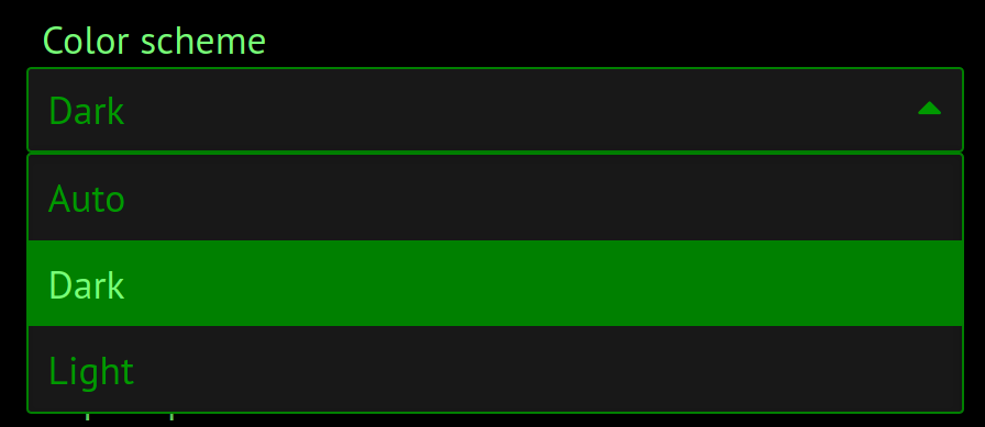
Listbox will use the style from input section but requires also some more customization.
With the following CSS, I can set
/* Listbox */
--autocomplete-bg: #181818;
--autocomplete-border: 1px solid #888;
--autocomplete-focus-bg: green;
Conclusion
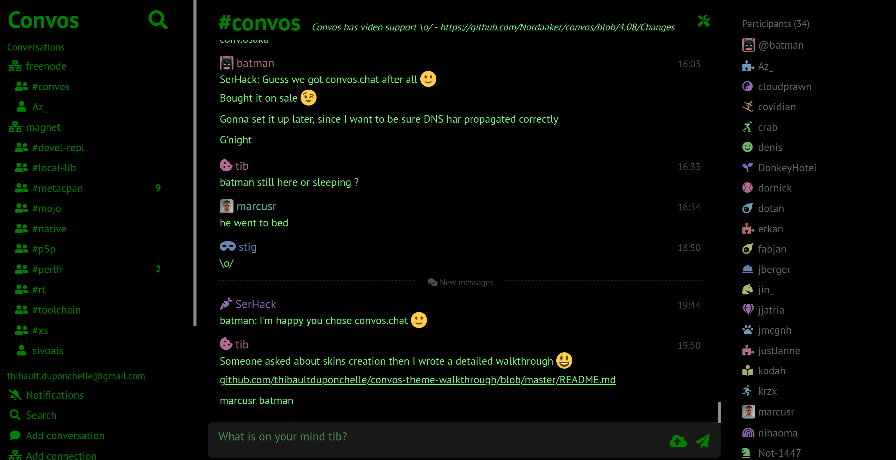
Here is the final result:
and
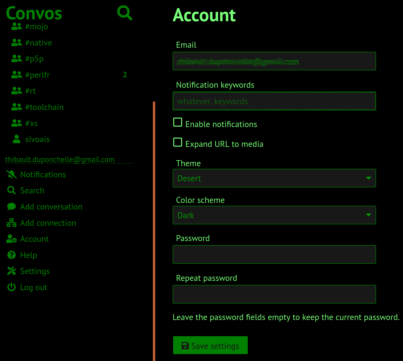
And the CSS code:
/*
 * name: Hacker
 */

:root {

  /* Backgrounds */
  --sidebar-left-bg: black;
  --body-bg: black;
  --sidebar-right-bg: black;

  /* Text color */
  --text-color: #77ff77;
  --link-color: green; /* Send text, upload file, setting hamburger... */
  --sidebar-right-text: #666666; /* Text color on right panel */
  --sidebar-left-text: green; /* Color of rooms when connected (selected or not) */

  /* The bakground when someone mentions you */
  --highlight-color-bg: #990000;

  /* Left panel */
  --sidebar-left-border: 1px solid black; /* Separator between left panel, can generally be ignored */
  --sidebar-left-border-bottom: #003300; /* Separator below "conversation" or "email" */
  --sidebar-left-frozen-color: #003300; /* Color of rooms when not connected */
  --sidebar-left-search-focus-bg: transparent; /* The background of the room name selected */
  --focus-outline: 0 0 3px 3px rgba(0, 255, 0, 0.5); /* Big shadow when selected */

  /*
  --sidebar-left-frozen-focus-bg: red;
  --sidebar-left-search-focus-border: red; /* The background of the room name selected */

  /* Buttons */
  --button-bg: green;
  --button-color: #181818;
  --button-border: 1px solid black;
  --button-danger-bg: #990000; /* Appears when you try to do something wrong */
  --button-disabled-bg: #002200;
  --button-disabled-border: 1px solid #002200; /* The border of a disabled button */
  --button-focus-outline: 1px solid #006600;
  --button-disabled-color: #006600;

  /* Various */
  --hr-border: 1px dashed green; /* Discussion separator between days */
  --code-bg: red; /* Bg color for code tags */

  /* Inputs */
  --input-focus-outline: 1px dotted green; /* Dashed border when selected */
  --input-bg: #181818;
  --input-color: #009900; /* The text typed */
  --input-border: 1px solid green; /* Green borders */
  --chat-input-bg: #181818; /* Where you type your messages */
  --input-disabled-bg: #181818;
  --input-disabled-color: #009900;
  --input-placeholder-color: #009900;
  --input-focus-placeholder-color: #bbb;

  /* Keep as is */
  --error-color: #ee2222;
  --success-color: #338833;
  --syntax-hl-base-bg: #fff;

  /* Listbox */
  --autocomplete-bg: #181818;
  --autocomplete-border: 1px solid #888;
  --autocomplete-focus-bg: green;
}
Tips and tricks
- Everything you don't define is inherited
- Only some vars can be overriden, to know which one, check other themes, try
some obvious names or check into
*.scssfiles. If missing, you can ask to add them. - The help page proposes some demo page, it is very convenient to test all pages (even the one that print not usually like 404)
- Light theme is easier for beginners because there are few variables to customize (do not need to set input backgrounds for instance).